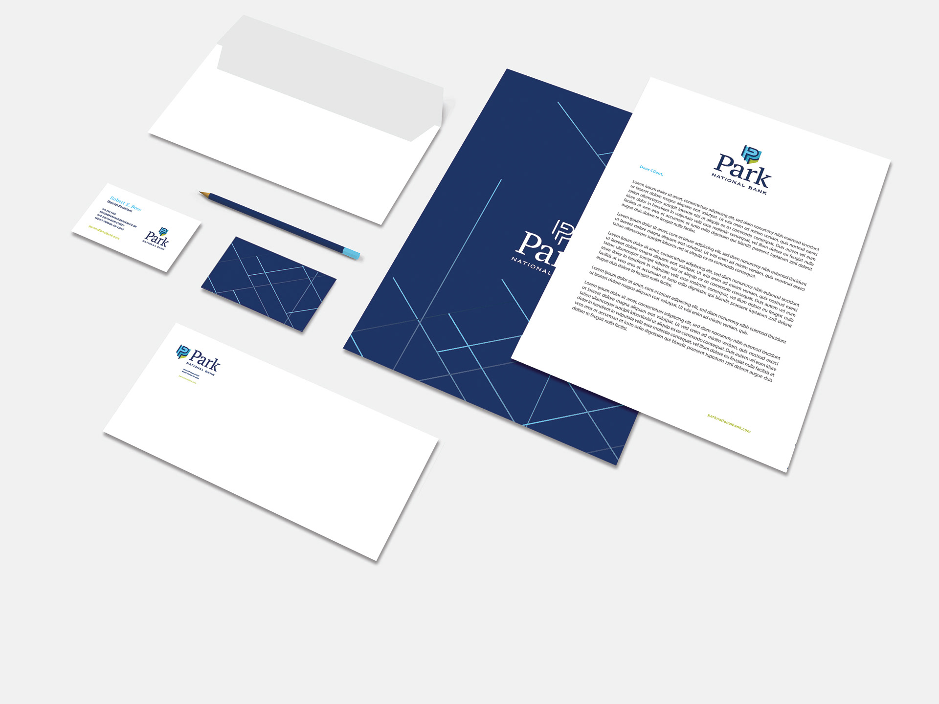
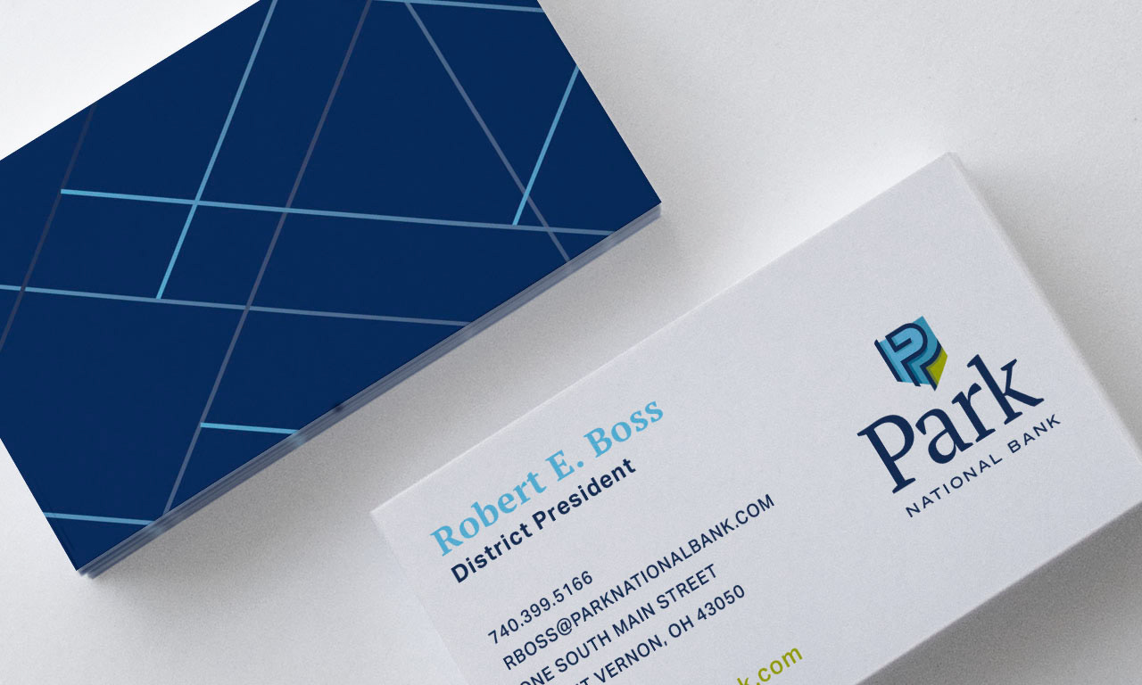
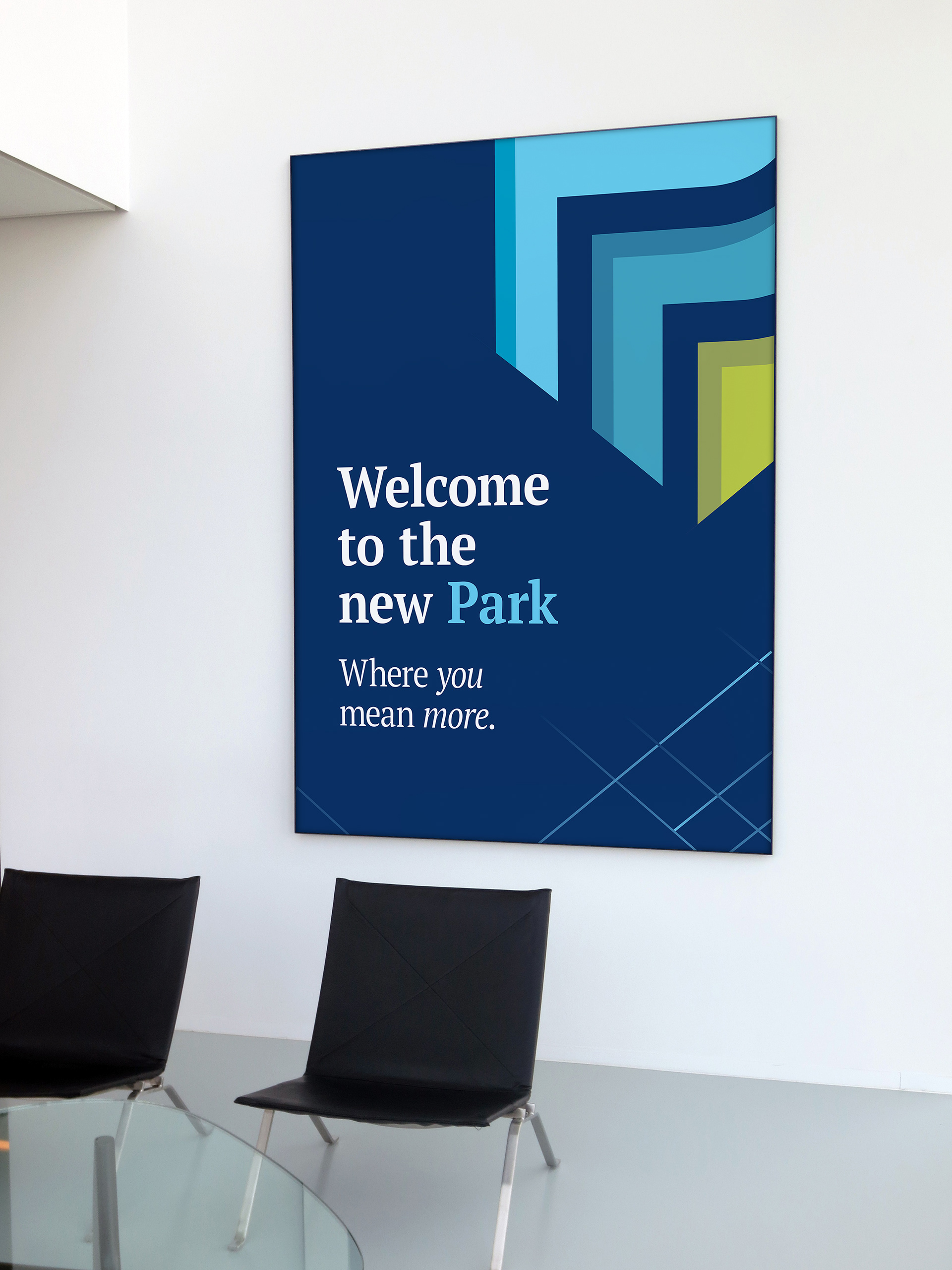
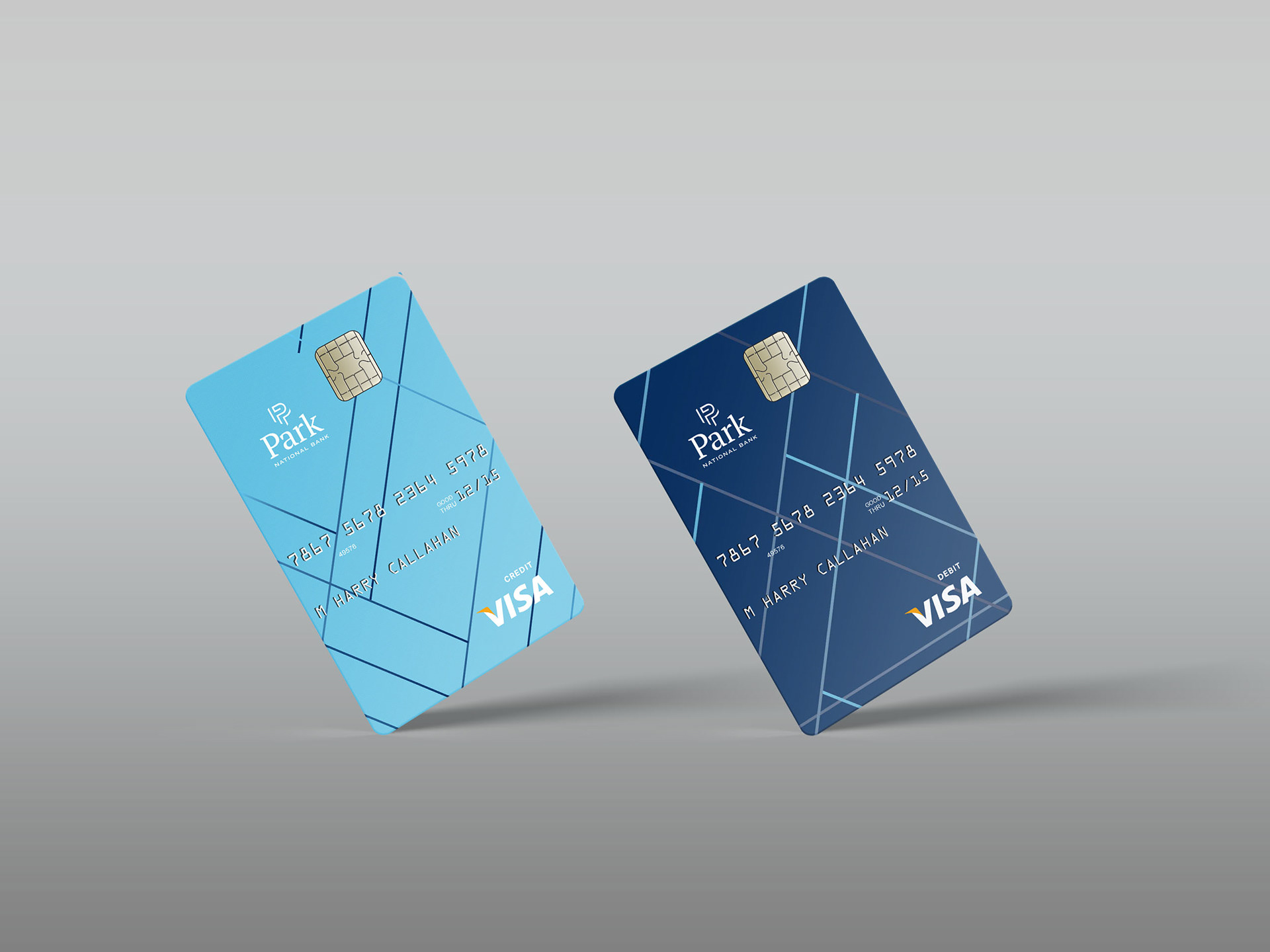
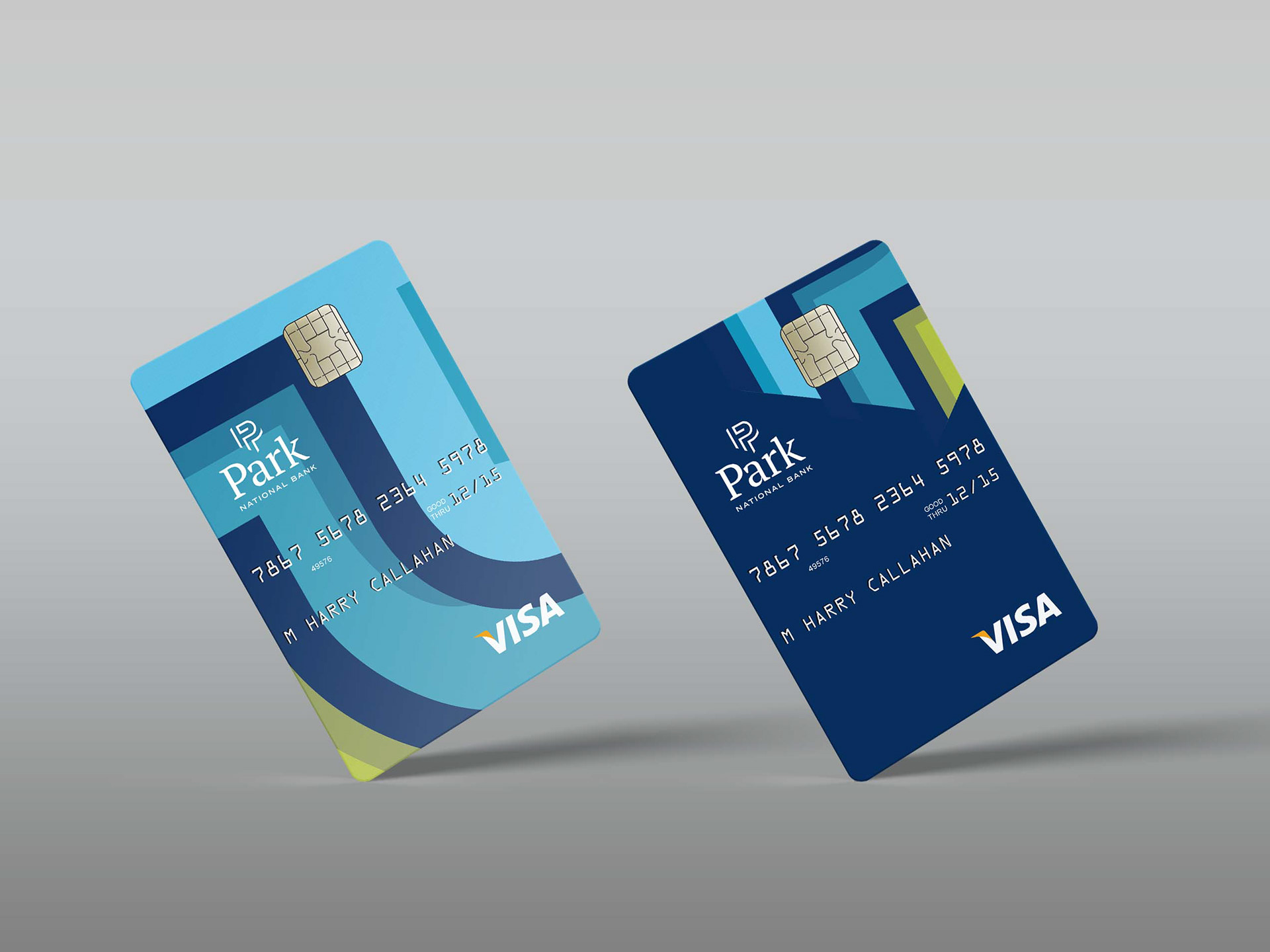
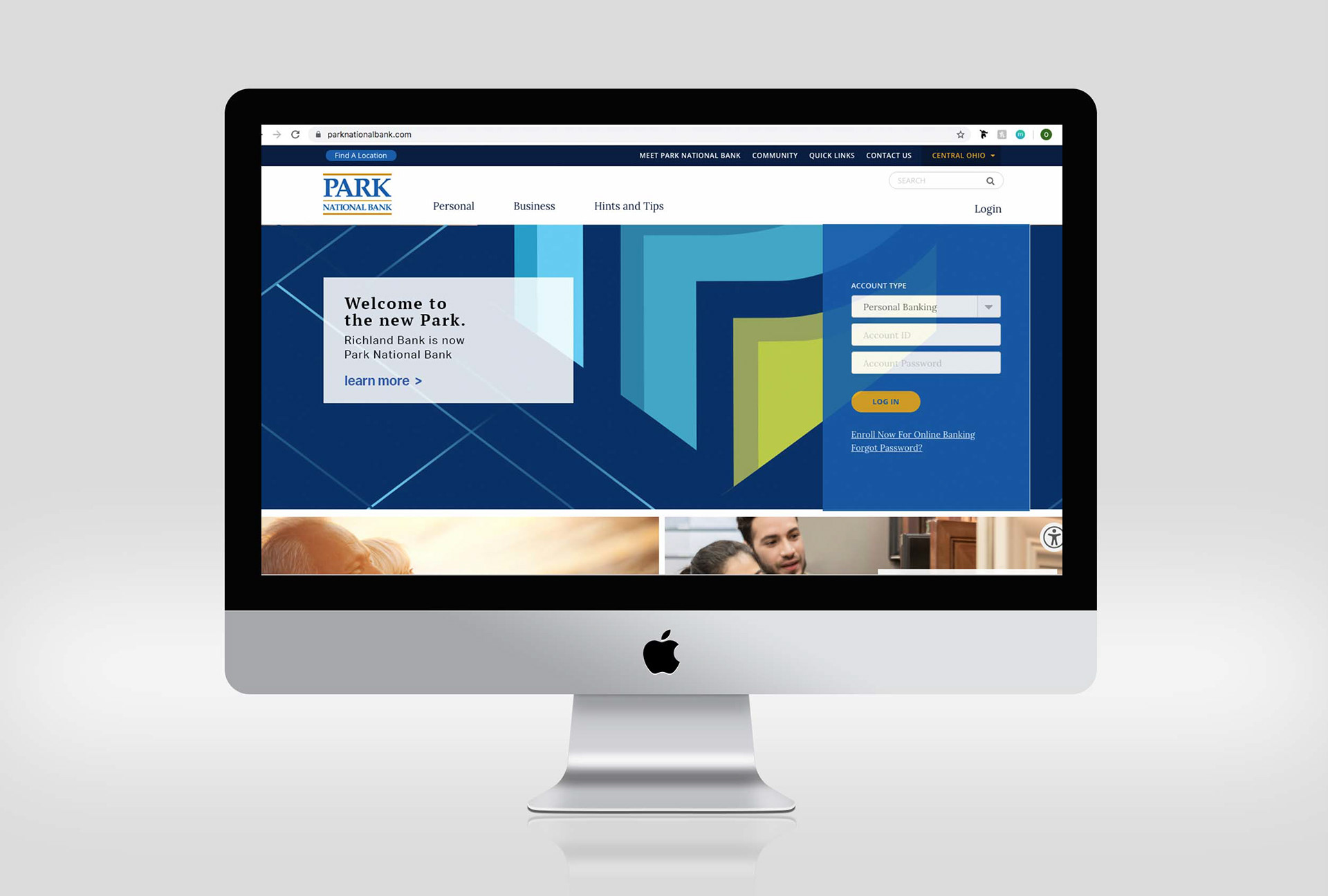
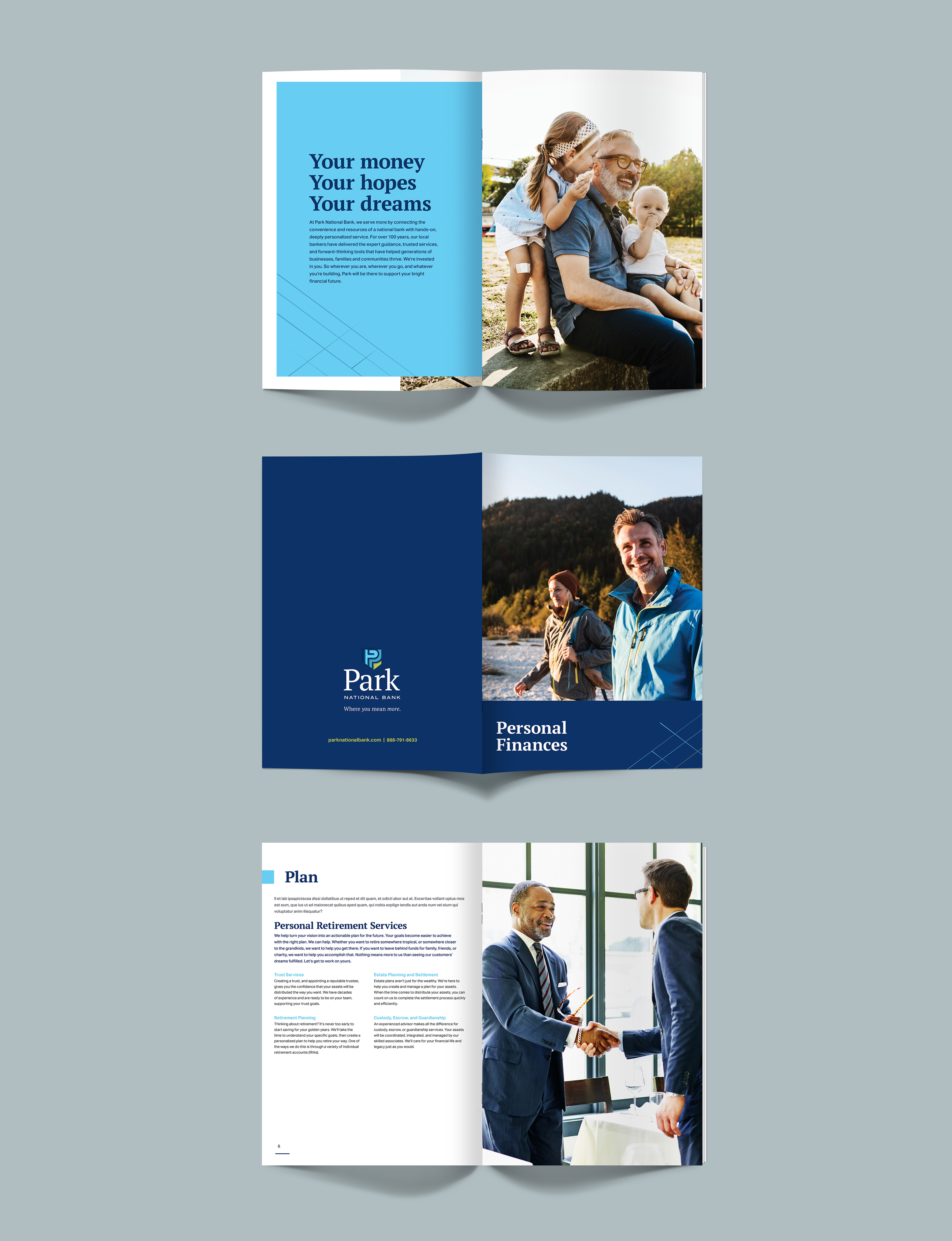
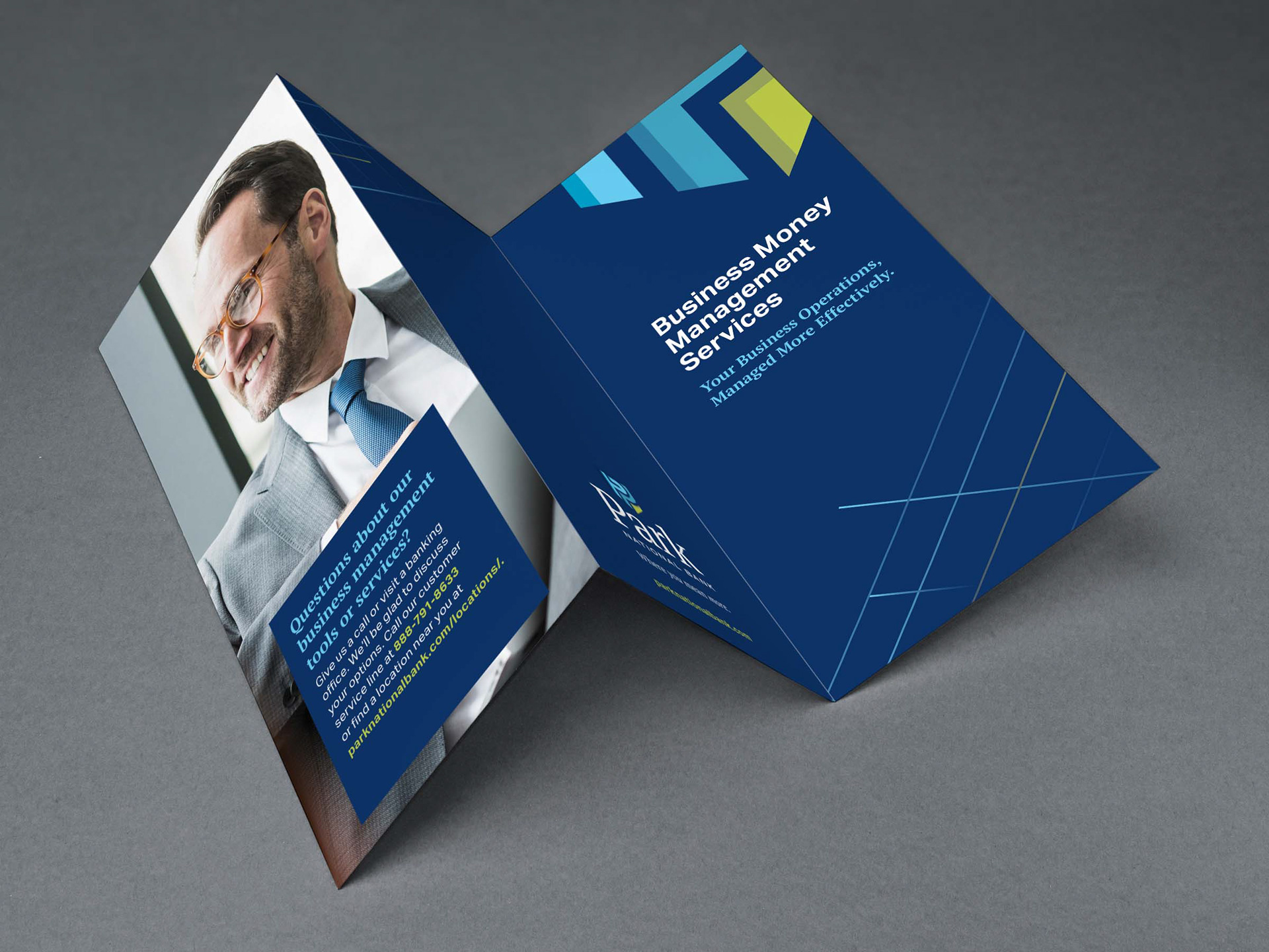
Bank rebrand.
This bank was a client who's goal was to consolidate their branches under one name (Park National Bank). They wanted a design that was clean and simple but could also convey a sense of family. An example of this are the lines used on the collateral pieces which compliment the shield logo nicely while both coming/merging together and being apart of the background.